How to Make Cool Underlines for Links with TailwindCSS
Making underlines for links instead of changing the color of the letters improves a lot the readability of documents. However, underlining itself does not allow to control the thickness of the line nor its color. There are two ways to achieve control on how the underlining looks like: using the
boxShadow
property of
TailwindCSS
, or tuning the background image.
Box Shadow
Tailwind provides some basic shadows, but if we want to add custom shadows to our links, we must edit the tailwind.config.js file, and add the following:
The syntax is exactly what box-shadow takes. Now, if we want to underline a link, we can use the following in the HTML:
We can also apply it globally to all links, by adding the following to the style.css file:
Background Image
Using a background image as an underline requires slightly more tuning but allows for much more stunning results. We can add to
style.css
after the
@tailwind utilities
line:
We use the
@layer base
to create a global style that will be applied to all the
a
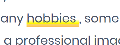
tags. The rest is CSS code to create a linear gradient that goes from orange, to yellow to transparent, from bottom to top. The result would like in the image below:

So, if you see those fancy underlines and want to create them with Tailwind, you know now where to start!
Backlinks
These are the other notes that link to this one.
